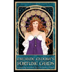
Visually pleasing, Madame Endora’s Fortune Cards are the right size to fit comfortably into almost any size hands for shuffling. The pictures are distinct and bright against the black background and the back of the card has an intricate woven design in gold which is also distinct against the black background. Sadly, closer inspection reveals that the cards and accompanying text are inconsistent, lack depth, and symbolism.
In the book, Filipak breaks the cards into five sections: Royal Court; Ream of Fable; Bestiary; the Treasury; and the Elements. At the beginning of each section, Filipak briefly describes the role of each section of cards. In the Royal Court she places the cards in stereotypical gender roles, which is very biased and shallow.In the Realm of Fable, the cards describe typical general concepts with characters like the Green Man, the Satyr, Medusa, the Siren, and the Sphinx. For the Green Man, she only describes him superficially calling him a protector of Nature which is a quickie explanation of his role but doesn’t touch on the deeper meanings of this archetype. In the section for the bestiary, Filipak chose to feed into superstition by using a stereotypical black cat as one of the characters. Her meanings for the cat, raven, and serpent lean towards the sinister and negative stereotypes. Additionally in this section, she chose to change the format of some of the pictures. Most of these cards appear as almost simple line drawings with an intricate frame surrounding it. They look like copies of tapestries. The inconsistency with the rest of the deck detracts from their impact as powerful symbols. Another inconsistency occurs in the Treasury section where Filipak uses stark drawings for the key and chalice but is much more detailed with the other cards. The final section of the Elements includes Sun, Moon, and Stars as elements, which they aren’t. Additionally she is a bit repetitive by having an Air card as well as a Winds of Change card. While these symbols fit the theme of the cards, the meanings attached lack impact and depth.
It may seem to be a small thing, but the font used in the book is difficult to read, especially when the reader realizes that there is no subtlety or depth to any of the meanings behind the cards. The author uses stereotypes like a snake representing deception rather than offering a more in depth look at what the symbols could represent.
Six different layouts for reading the cards are given and the reader is told exactly how the deck should be shuffled and handled for the first two. Obviously, this leaves no room for the readers own methods of shuffling or intuition, but also raises the question of how important it is to follow those directions exactly for the remaining five layouts.
None of the spreads are new or innovative with superficial meanings assigned to each position. For example, the Four Winds layout, where the description of what each direction means does not match most Pagan correspondences: south is linked to earthly pursuits, which is usually a function of earth/north. The rationale behind the author’s system is not given, so the reader is left with confusion and a strong question about the validity of the rest of the information.
If you love the cards, and they are very pretty, then ignore what Filipak writes and look up the meanings of the symbols in other sources. Better yet don’t bother buying the cards at all.
1 broomstick out of five
~review by Eileen Troemel
Author: Christine Filipak and Joseph Vargo
Monolith Graphics, 2003
