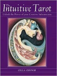
With more than 20 years in the making, The Intuitive Tarot reflects a style of the times. Cilla Conway actually did her first drawing of the Fool in 1973, but the deck itself was not published until 2004.
Looking at the backs of the cards, you can see why this deck might go unnoticed; they are completely purple with a grey oval surrounding the middle of the card, a very simple image. Conway states that the idea of the oval, which is carried through on the front of the cards, was one that came to her very early on in the development of this deck. If you're looking at the deck for the first time, you may be surprised at the lack of any sort of activity here. Overall, the cards felt slippery to me, and they tended to be a little less rectangular than most decks I've worked with in the past.
Turning over the cards, once again you see the oval shape, which frames each card image. Each frame is colored to match the card, so it tends to not be as obtrusive as it might have been if they were all purple, for example. The images were drawn in such a way as to suggest that there is more to the picture outside the oval frame, which I liked. It’s almost like you are looking through a window or ovoid portal onto each card.
What you’ll find here is an interesting mix of styles. Some cards, like the One of Rods—the term “Ace” is not used on any of the suits of this deck—are very abstract; you’re not really sure what you’re looking at. I had to struggle to figure out what this card was trying to convey. On others, especially the court cards, there is more detail. But the human figures on all of the cards are different. Some have defined facial features while others do not. Some reminded me more of unfinished artist sketches than a finished product.
From an imagery perspective, this is far from a RWS clone. The Fool has a man on the card, with the sun in the background and a few birds in the red-orange sky. That’s it. There isn’t much to go on, and that was likely Conway’s intent; take away imagery and what you “see” has to come solely from within. On others, like the Two of Cups, the reader is given more information to spark the subconscious mind—two people embracing on the card, even though the people are somewhat abstract. Sometimes there is a clear reference to RWS imagery in this deck, but it is far from the norm. One example is the Nine of Swords. An abstract figure whose face you cannot see is holding its head in its hands with the nine swords in the air above, but there is no bed and a mountain range is set in the background.
The book that comes with the deck is essential to understanding what Conway was trying to achieve. I don’t know that I’d give this set to a beginner, because when Conway talks about using the book to see the meanings of the card, she tells people to discard the book and go with their intuitive feelings. While I’m all for letting the intuition guide a reader, I think an inexperienced reader might not know where to begin.
As much as our intuitive minds are finding the meanings for us, I don’t know that I could use The Intuitive Tarot in my professional practice, at least not regularly. Even though the cards are for us and not for the client, I doubt that this deck would have a great appeal among my clients. For me, the bottom line is the artwork. If you connect with Conway’s artwork and that 1970’s abstract style, you’ll love it. If you don’t, I’d definitely pass.
~review by John Marani
Author: Cilla Conway
St. Martin’s, 2004
boxed deck-book set, $24.95